As the semester comes to an end, so does Digital Media class. It has been a really fun and interesting class, and I’ve learned a lot about my rights as a student journalist. I’ve also learned a lot about designing on InDesign. I enjoyed all of the new things I learned, but there were also a lot of projects. Sometimes I would forget about something because it seemed like we had several things going on at once. I really enjoyed the “One in 1,000” project because I had never really interviewed people or edited audio to make that kind of video. I also thought the Prom Design project was a good way to get creative and experiment with InDesign. I like that we had to do blogs every week, although sometimes I did forget to write them or to comment on everyone’s. Other than that, I’ve really enjoyed everything in this class, especially the two movies we watched 🙂 Thanks, Mrs. Huddleston, for everything you taught me!
On to BAD Graphic Design..
Posted in Uncategorized with tags bad graphic design, bad websites on November 30, 2010 by chasemorThere is some great graphic design out there, but I feel like there may be more bad examples of graphic design than good. We’ve all seen those awful websites that are usually made by clueless internet users or those who try to do a little too much. Here are some examples of bad graphic design.
 First of all, this website’s name is a little weird. That’s not the only bad part. The background is awful–definitely not easy on the eyes. There is a small picture featuring their different products at the top; the items are too small and you can’t even read the text that says what each item is. Plus the picture isn’t centered for some reason. The text on the page isn’t readable either…here’s the link if you have any desire to see it yourself.
Wow. My eyes don’t ‘t even know where to look here. There are so many pictures, colors, and columns, and everything is disorganized. I hate being disorganized so this mess really bothers me! There’s just too much going on. Oh my…
 So, this site is apparently the “Home of The Most Beautiful Pages on the WWW–Hosanna Afghan Hounds & AAA World Wide Web Design.” Well, not only is this random, but it is also ironic. This page was apparently designed by AAA World Wide Web Design, yet I don’t see anything special (or good) about their designing abilities. There is too much text, a ton of random ads floating in space, and butterflies flying around in the background…need I say more? Check it out.
Well, that’s all for now. I hope you enjoyed my interesting choices of bad graphic design 🙂
Thanksgiving 2011
Posted in Uncategorized with tags cupcakes, kickball, thanksgiving, turkey on November 29, 2010 by chasemorI alternate spending Thanksgiving with my mom and dad every other year. This year my brother and I were scheduled to be with my mom. We always go to her mother’s house, which is only a few minutes away from our house. My mom’s three sisters, one brother, and the spouses of those who are married all attend, as well. We only have two cousins, unfortunately, out of all of my mom’s siblings. We still have fun, though, and the cousins play outside while the adults cook the meal; this usually includes my cousins and brother (all boys) skateboarding and me taking action shots of them with my camera…After we eat, we always play a game of kickball. Sounds cheesy, I know, but it’s always so funny and usually competitive. This year it was pretty cloudy all day which was a bummer, but we still played our game until it got dark. I don’t think we kept score this year. Probably because there was a hole in the kickball…
Good Graphic Design
Posted in Uncategorized on November 15, 2010 by chasemorThere are endless examples of good graphic design, even among all of the terrible ones. I decided to critique some cool logos of well-known places and businesses, including some logos that have changed recently. Here are some examples of great graphic design.
 The new KFC logo is much more modern and inviting. He even has an apron on now! The old one had too much contrast, and I don’t like how it is angled.
I love this logo. The shapes and colors are awesome and grab your attention. They kind of resemble a string of islands. I also like the sans serif, easy-to-read font.
 The old BP logo was boring and (I think) ugly. The new one is modern, fresh and bright, incorporating different colors and cool shapes.
 Burger King’s old logo was too plain, I think. Now more colors are incorporated and there is more variety in the sizes and angles of the objects.
 The new AT&T logo is much more modern and represents advancing technology. I like the 3-D sphere and that the font is lowercase, which is a little different.
There are some examples of what I consider good graphic design. I enjoyed looking at this list of good and bad logo redesigns. Check them out.
Shattered Glass
Posted in Uncategorized with tags fraud, Hayden Christensen, movie, New Republic, Shattered Glass, Stephen Glass on November 5, 2010 by chasemorThis week our digital media class watched Shattered Glass, a movie based on the journalistic career of a young man named Stephen Glass. He worked as a reporter for an esteemed magazine called the New Republic for three years, all the while completely making up facts, quotations, and even events to make his articles enjoyable and popular.
After his fraud was discovered, his coworkers were shocked that this aspiring and talented reporter could have been inventing stories for so long without anyone finding out, especially with the fact checks they had. I think this scenario shows that articles should always be checked thoroughly to make sure they are 100% fact. I don’t understand how he wrote so many stories without being caught. I think that today we have more accurate methods of making sure this doesn’t happen, especially with today’s technology.
A point brought up in my class was why Stephen Glass wrote articles instead of fictional stories, which is what he was so good at. We decided that maybe he had a mental illness, because even when he told himself he needed to stop, he continued to invent outrageous stories. Whatever the case, I really enjoyed the movie, and it taught me that you have to be careful what you write in journalism because it can lead to serious consequences. And of course, Hayden Christensen was a plus.
Service Club
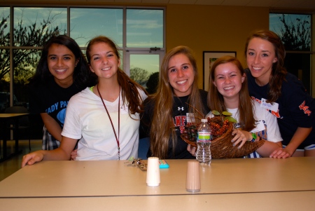
Posted in Uncategorized with tags Nashville, Second Harvest Food Bank, service club on October 28, 2010 by chasemorLast year, the Service Club was started at FRA. Members plan service projects at various organizations and attempt to help the community and represent FRA. I joined this club recently, and our first project was to go to the Second Harvest Food Bank last night to pack bags for their “Backpack” Program. The bags we packed will go to teachers at schools around Nashville to distribute to kids who don’t get enough to eat on the weekends. Only about 12 of us could make it last night, but we still had a lot of fun. I love serving others and I’m looking forward to more projects in the future. Here are some pictures from last night.
Umm What’s the First Amendment..?
Posted in Uncategorized with tags FIrst Amendment, freedom of speech on October 21, 2010 by chasemorWe may not realize it, but the First Amendment to the Constitution is extremely important to American society. It is the reason we are able to have freedom of religion, speech, and press, and the right to peacefully assemble and petition the government. More than likely, a plethora of Americans is ignorant of the significance of this Amendment.
Without it, we couldn’t speak out about things we believed in, or practice any religion we wanted to. To me, freedom of speech is the most important right protected by this amendment. Although there are restrictions on this right, including obscenity, it is still crucial to American society. We don’t seem to realize how different our society would be without the freedom of speech–our opinions and beliefs would be severely hindered, at least in the public aspect. We should be truly thankful to the writers of the Bill of Rights, because without it, we would lack many rights that today seem vital to our society and culture.
Finally Fall!
Posted in Uncategorized with tags autumn, fall, leaves, photography on October 14, 2010 by chasemorFall is definitely my favorite season of the year. I love the cool, jean-wearing weather and all of the beautiful Autumn colors. I love all of the orange, red, and yellow trees lining the streets and the leaves covering the ground. I always look forward to this time of year, and I love taking pictures of the beauty of fall. The other day I was playing around with settings on my camera and found the perfect white-balance setting that made my photographs of an orange tree in my yard so much more vibrant than on the automatic setting. I hope to experiment some more as more trees begin to change. Here are some of the pictures I took–let me know what you think! 🙂
Try searching “autumn” on flickr.com. There are some great photos from photographers around the world.
200,000 Fonts to Choose From?
Posted in Uncategorized on October 7, 2010 by chasemorIn our world today, technology is the obviously the main source for communication, entertainment, and information. With advancing technology, even such seemingly unimportant details as fonts have become vital to design. BBC’s article about the importance of fonts, “Do typefaces really matter?”, demonstrates how people react to certain fonts in items they read. Some people can’t even enjoy a movie because they’re focusing so much on the fonts. Many people disliked the hit-movie Avatar because of the font of the subtitles. Although I agree that fonts are important, I wouldn’t let a font influence my opinion of a movie. I do think that they are important for websites, magazines, books, etc.
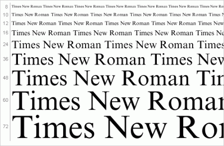
I really don’t like fonts such as Times New Roman and Arial that are overly simple and boring. They seem to make whatever I’m reading less interesting.
One of my favorite fonts is pretty plain, though. If I had to choose a very plain, readable font, I would pick Century Gothic. I like that it is sans serif.
I also like Broadway for titles or larger font sizes. It’s pretty plain and easy to read, but it’s still fun.
Junior/Senior Cheerleader and Football Player Signing
Posted in Uncategorized with tags cheerleading, signing on September 30, 2010 by chasemorToday the juniors and seniors on the football team and cheerleading squad had the opportunity to sign t-shirts for lower schoolers. It was a lot of fun, and the kids look up to us so much. I admit writing my name and a little heart over and over again got a little boring, but it’s better than class 🙂 I took a video of the action, but unfortunately I’ve had trouble uploading it to Word Press. Hopefully I’ll get it to work. My video features the lovely Malone Wayland and Caroline Pennington (AKA “Carol”).


